Automatic pixel art from photos
Disclaimer: Properly authored pixel art is awesome. Automated pixel art is fast food: great when you don't have enough money (to hire) or time (to author). And does the trick when you're starving.
I'm not an artist, I love pixel art, and frequently I want something here and now. So, how do I get copious amounts of pixel art without bugging a pixel artist or becoming one myself? Software of course. The style that I'm after is retro 90's look: slightly pixelated and with a limited, painterly color palette. A few examples:
Old game art, fantastic colours
Pixel art, great mood and selection of colours
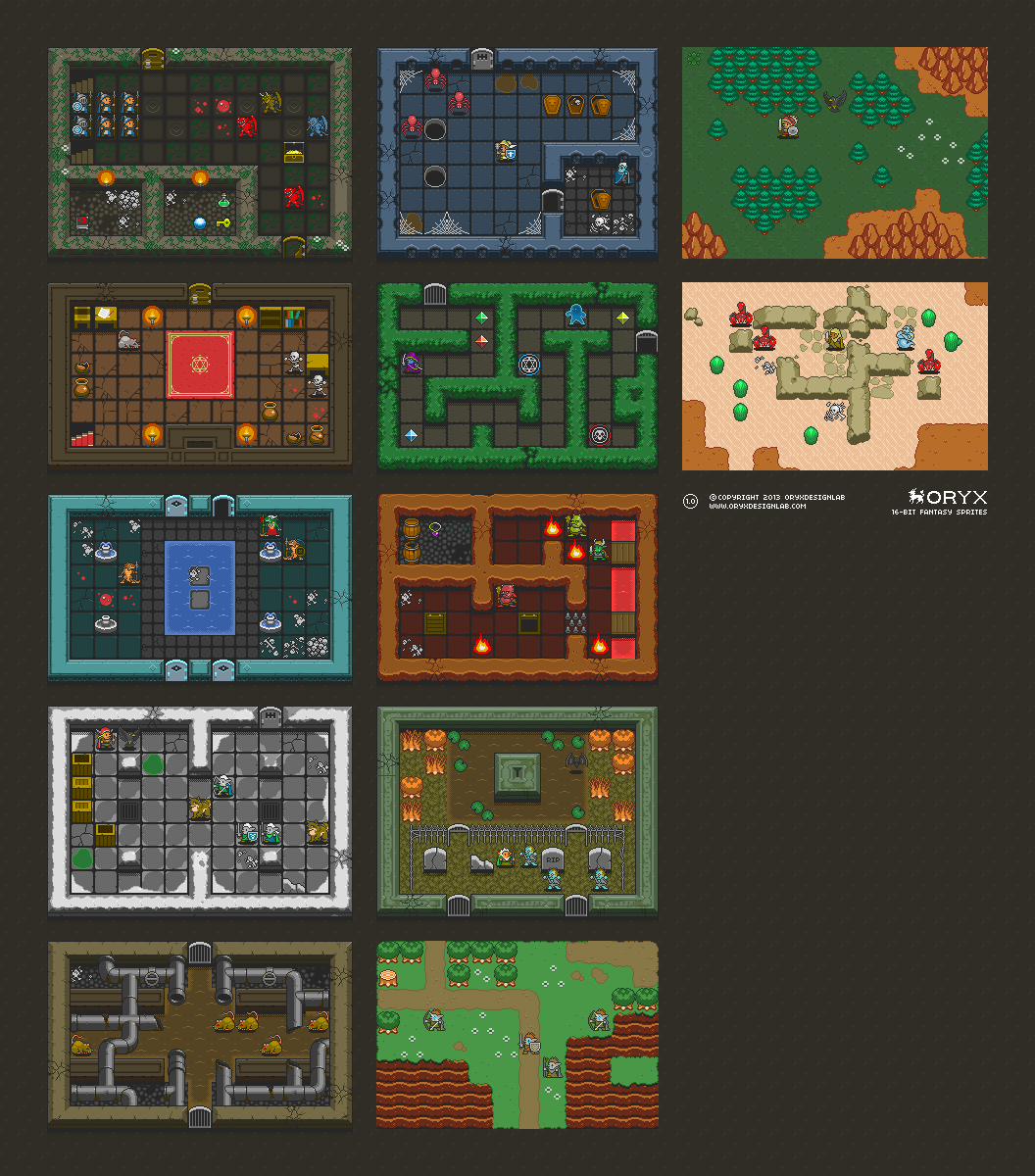
Great tile design (sprites are sometimes too "cute" for me unfortunately) and great colours. I bought them as I love them! :)
So, while I don't hope to automatically generate stuff of quality like the above from photos, I made a tool to convert landscape photos to pixel-art style. There are two components to the process:
- Palettization (Mapping full colour range to a limited palette)
- Pixelation (Downscaling the image to look a bit retro)
My approach is quite simple, and is as follows:
- Load the source image
- Select a color difference function (I used code from here)
- Convert image pixels to color space used by the difference function
- Select a palette. I got some from here. Additionally, I got all the unique colors in Oryx tileset and made a palette out of them too (the largest palette: about 1000 colors)
- Convert palette pixels to color space used by the difference function
- For each pixel, select the palette entry that minimizes the color difference between itself and the source pixel.
- Downscale the image by a factor. For each block of pixels NxN that corresponds to 1x1 pixel in the downscaled image, fetch the palette color that appears the most times.
And that's it! So, I tried the above on a few images (found in google, none of them is mine), and I got ... very mixed results. Below I'll show the original image and a few good/bad/quirky results.
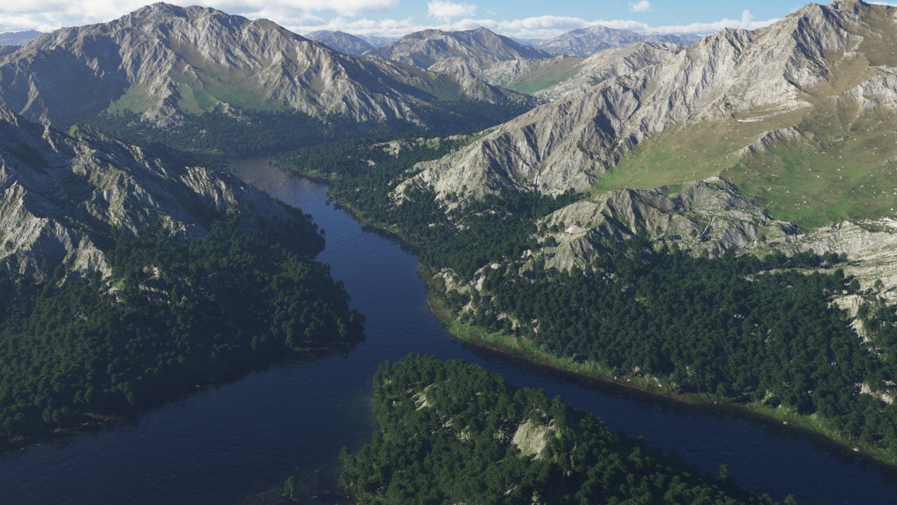
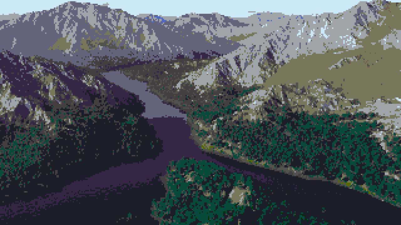
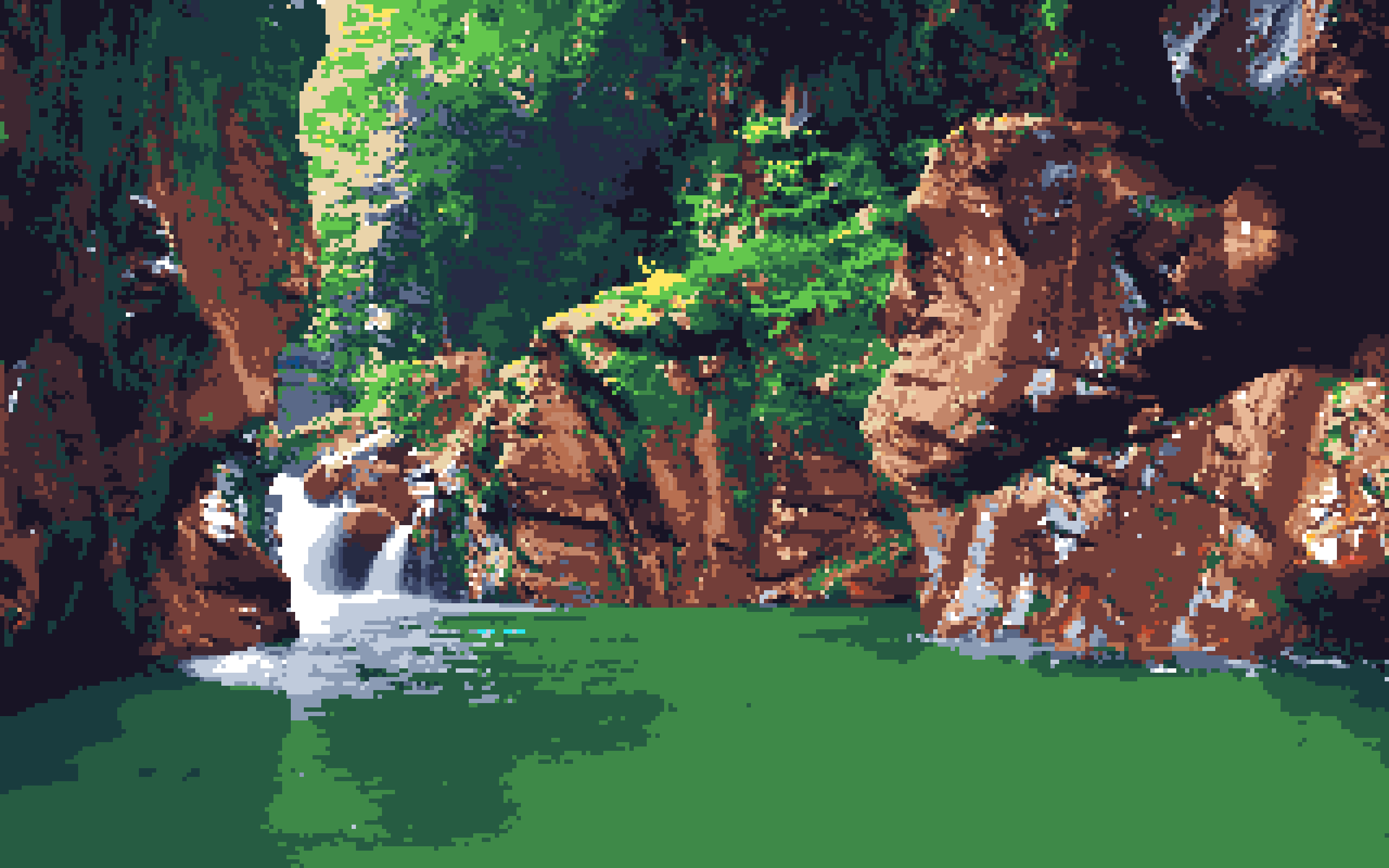
Mountain/River
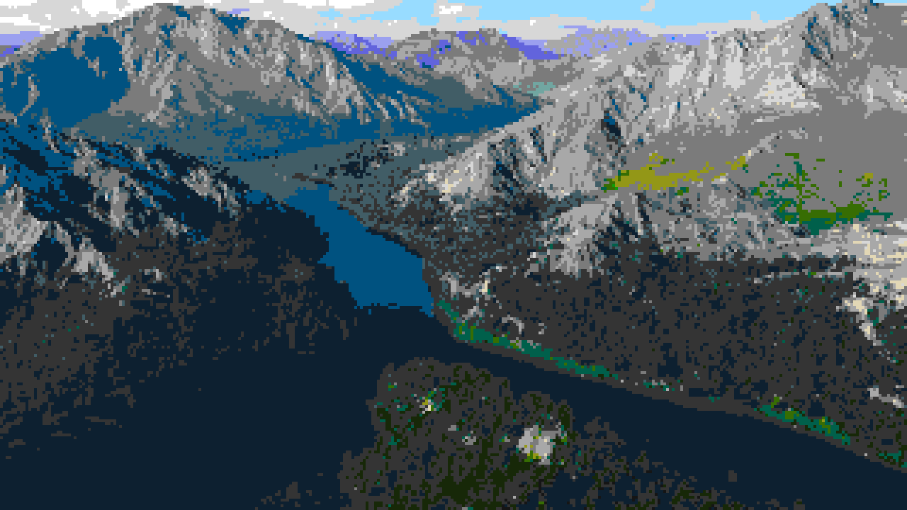
Cie94 w/ Oryx, downscaled 2x. Good

Cie2000 w/ famicube, downscaled 2x. Not good
Cie94, GraphicArts w/ psygnosia, downscaled 2x. Lo-spec but good!
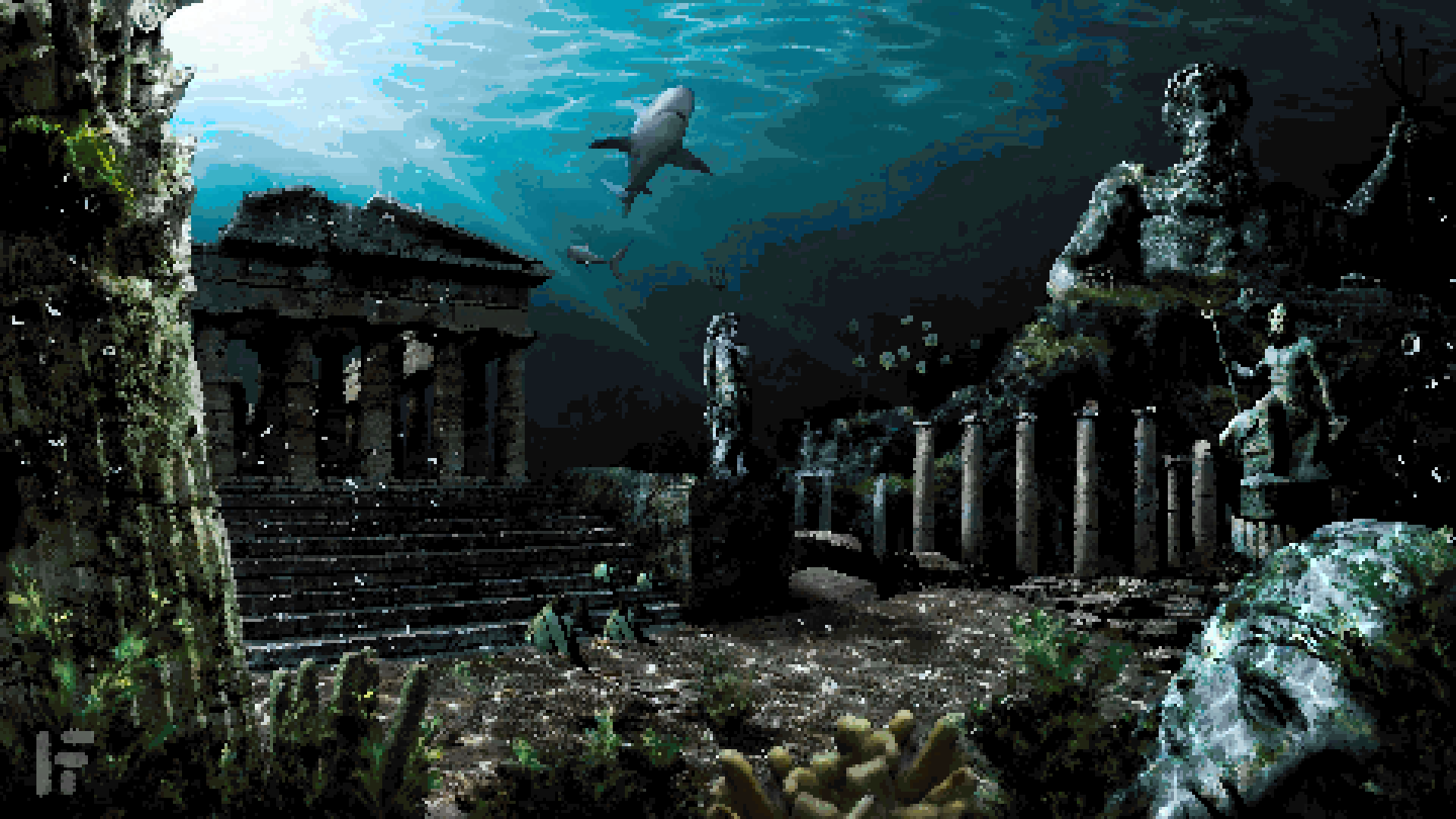
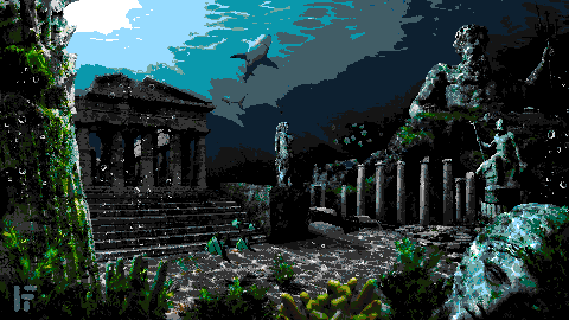
Atlantis

Cie94 GraphicArts w/ Oryx, downscaled 2x, good
Cie94 GraphicArts w/ famicube, downscaled 2x, good. Sharks are a bit of a problem as the sea water bleeds in
Cie1976 w/ Endesga-16, downscaled 2x, bad.

Euclidean distance w/ Oryx, downscaled 2x, bad

River

Cie2000 w/ oryx, downscaled just 1x, it's way too realistic.

Cie94 GraphicArts w/ Oryx, downscaled 3x, a bit better, but still a bit realistic
Cie2000 GraphicArts w/ Endesga-32, downscaled 3x. Not as realistic, but a bit worse quality.
Castle
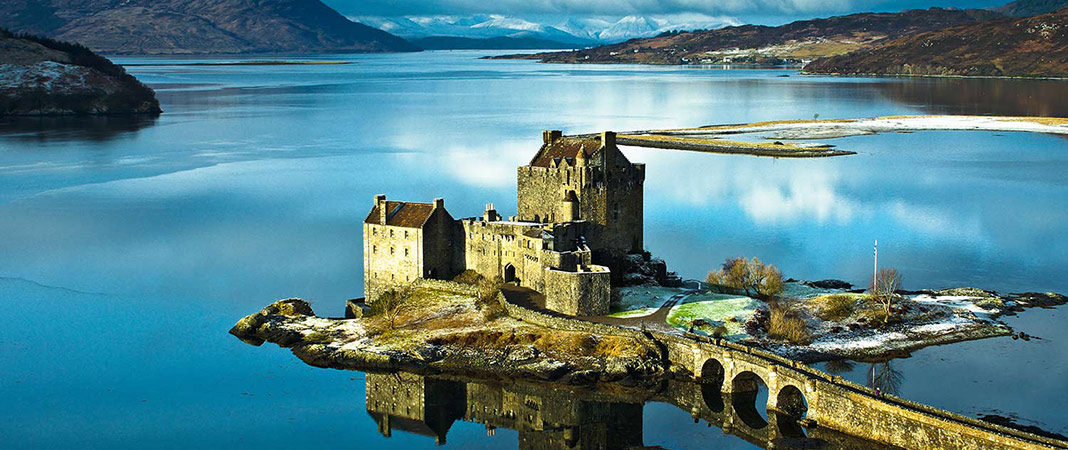
Cie1976 w/ oryx, downscaled 1x. A bit too realistic

Cie1976 w/ famicube, downscaled 1x. A bit too damaged and noisy.

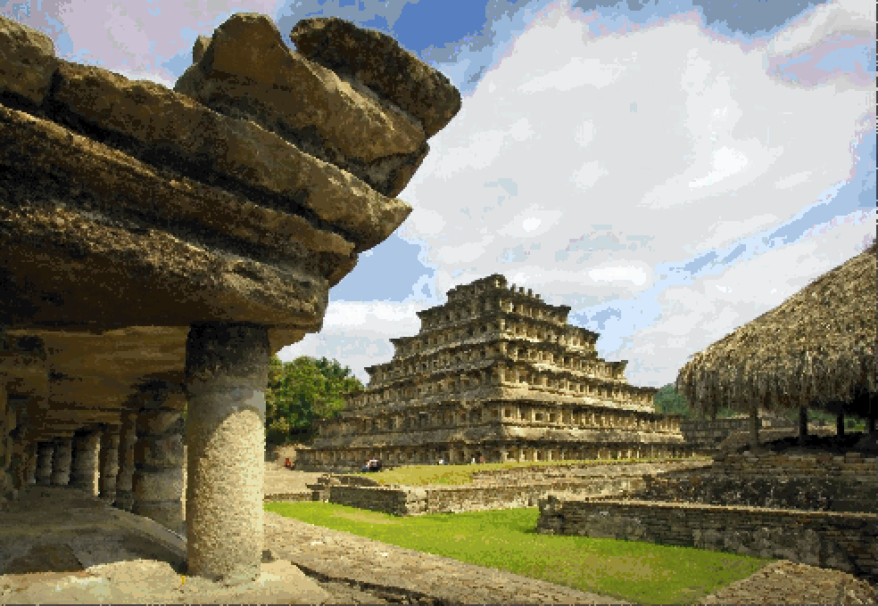
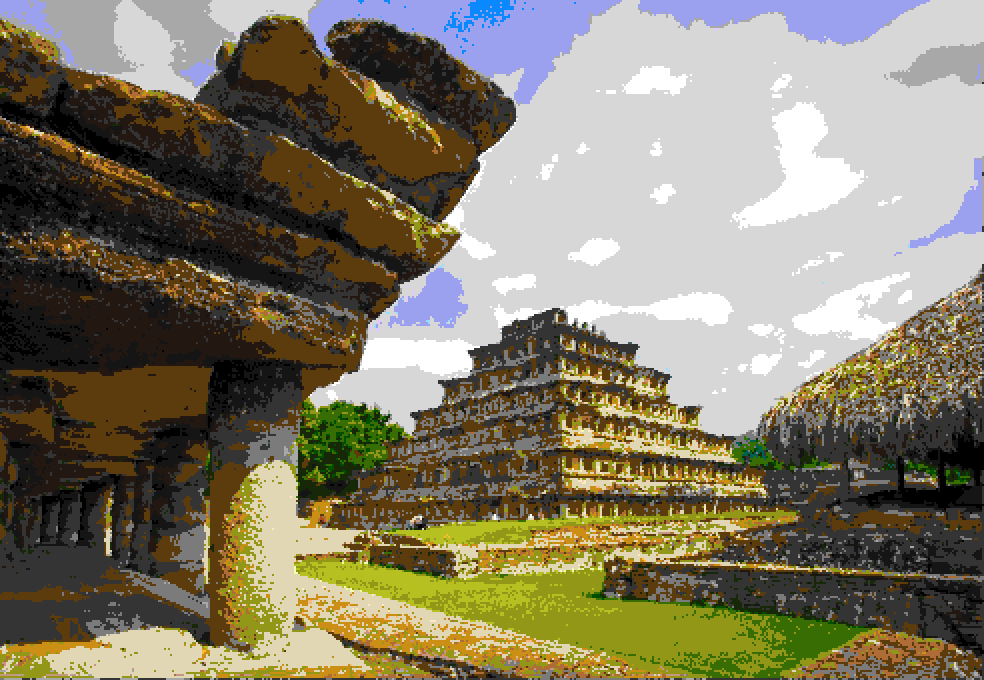
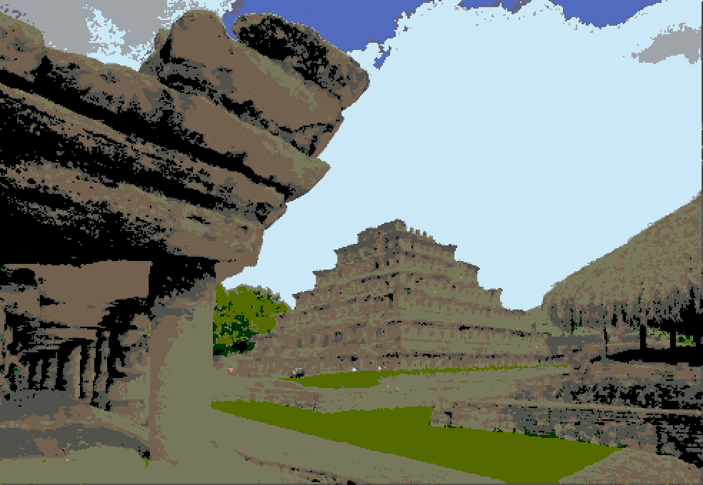
Mexico
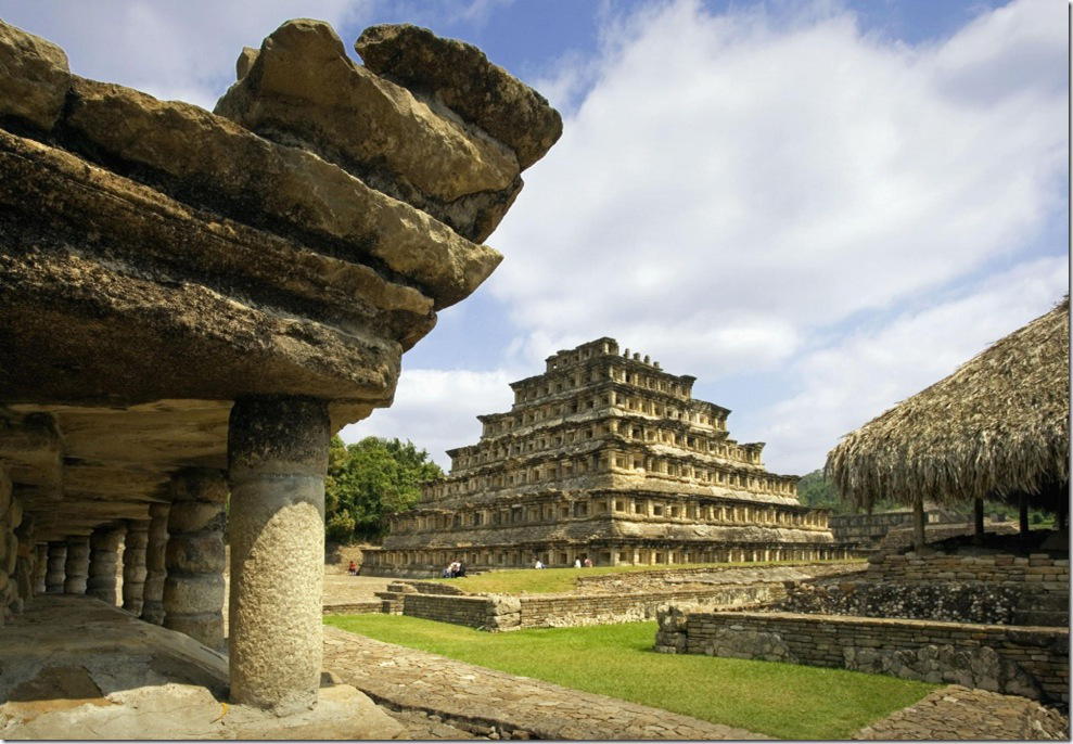
Cie2000 w/ oryx, downscaled 1x. A bit too realistic. Additional downscale would destroy the geometrical details.
Cie2000 w/ famicube, not good.
Cie94 Textiles w/ psygnosia, quite bad.
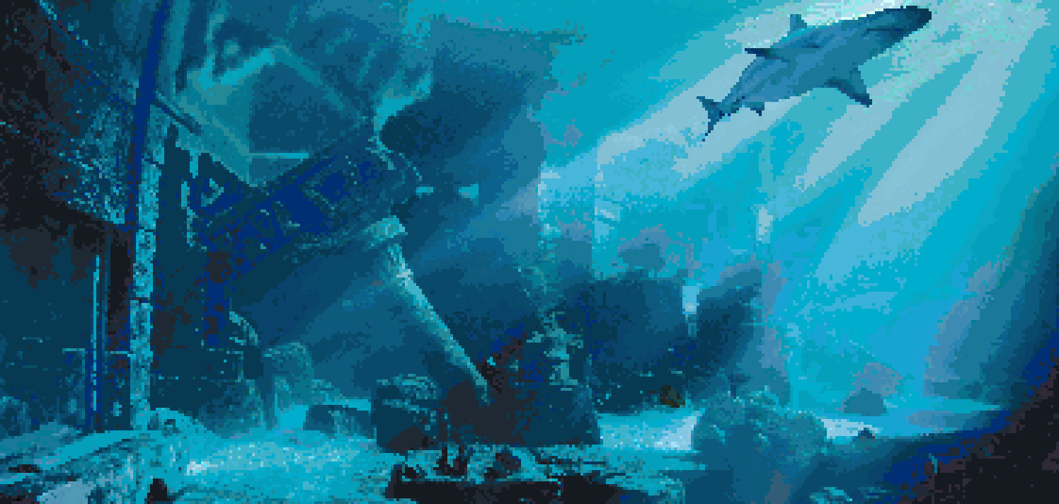
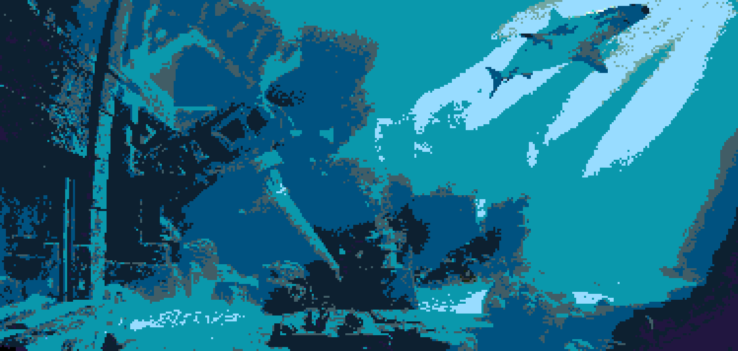
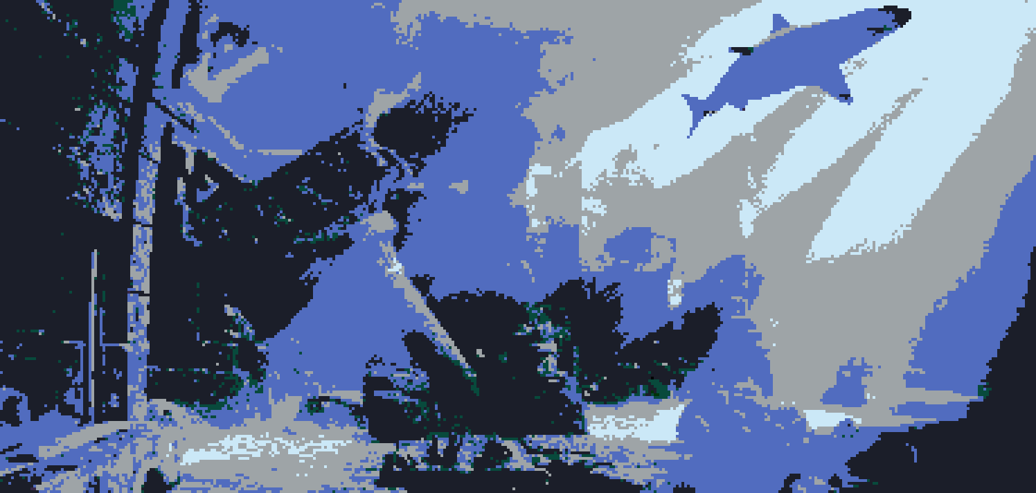
Underwater ruins
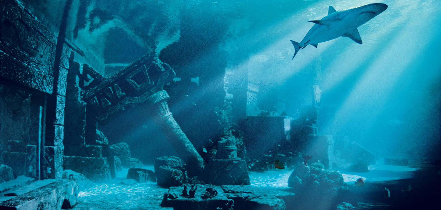
Cie2000 w/ oryx, downscaled 2x. This looks great! Good for a change.
Cie2000 w/ famicube, not so great.
Cie2000 w/ psygnosia, not great either. the water is gray and the shark is bluish. Well ... no.
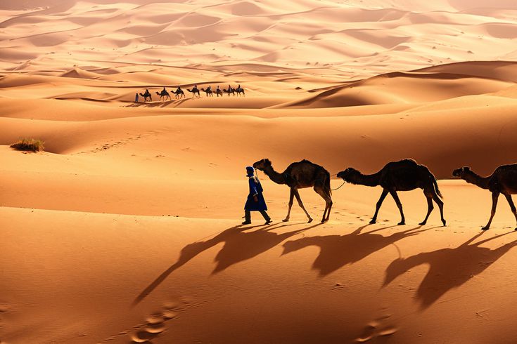
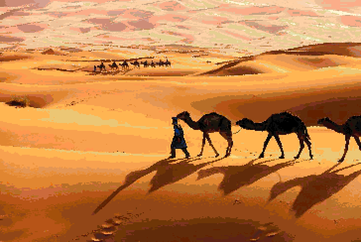
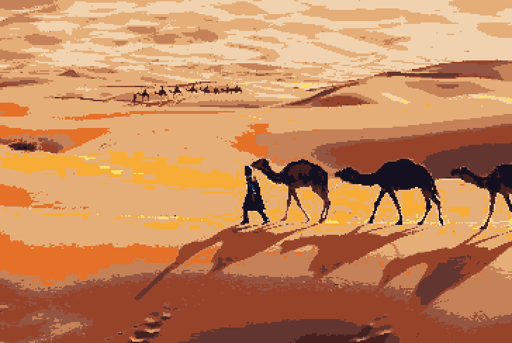
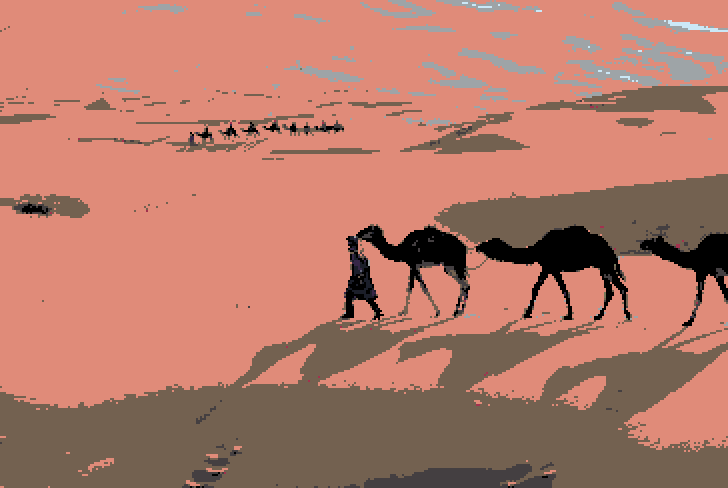
Sahara
Cie2000 w/ oryx, doable
Cie2000 w/ endesga, quite bad, but at least is good in making the JPG artifacts very very visible.
Cie2000 w/ psygnosia, not that bad actually! Even if quite lo-spec.
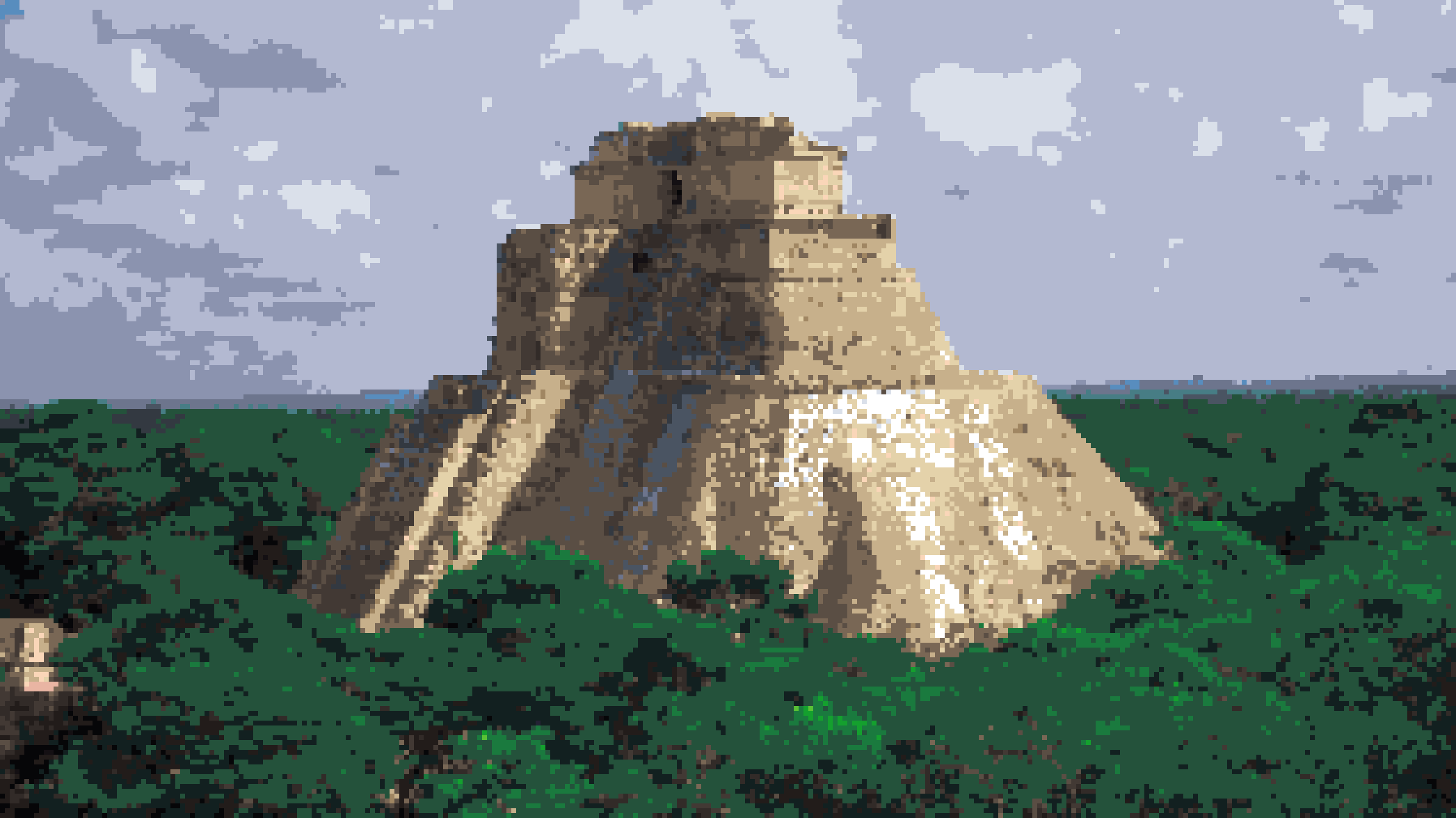
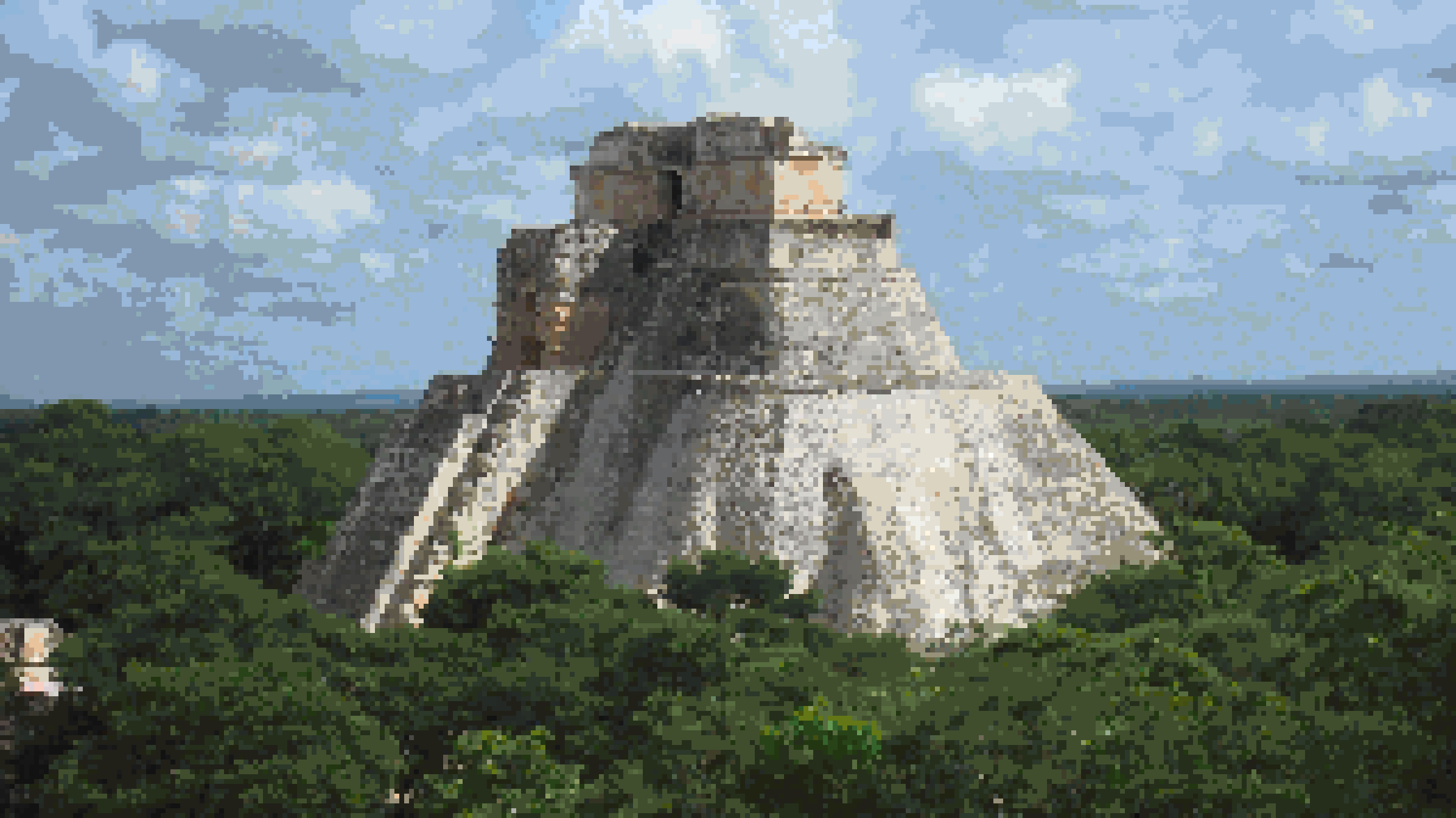
Yucatan

Cie94 Textiles, w/ aap64, downscaled 3x. A bit too damaged, but I like it
Cie2000 w/ oryx, downscaled 3x. It's good, but a bit too realistic
So, the experiment was a failure, but I learned a few things from it:
- Most important: The visual appeal of the results greatly depends on the colours used in the original. A grayish brown image won't magically transform to colourful, just because the target palette is. And a simple color distance doesn't solve the issue. We need a more sophisticated color transfer
- Distinguish between surface texture and geometric silhouettes: surface texture colours need to be somewhat flattened, while silhouettes need to be preserved
- could use a bilateral filter, and edge detection
- Consider dithering. Can reduce color error, but do we want that? It certainly helps with the blotches/banding.
- When using a palette with lots of colours, doesn't mean we should strive to use all of them. The color distance metric tries to preserve the original colours, which would be realistic. We don't want that.
- Pick the brains of pixel artists for their approach (Duh)
- Use high quality images, with minimal JPG compression artifacts. (Duh, but I was too lazy for this one)
- Use Photoshop/GIMP/etc. The more sophisticated the algorithm gets, the more tedious it is to write/update a custom tool to do that.