Back to GUI
Plenty of work this week, shifting gears bit. First part was a mix of things from last week, and then I shifted over to GUI.
Various changes
- Minor foraging updates.
- When you're foraging, floating text shows the acquired items, so that you don't have to squint at the log (which also shows that information).
- Slightly better patch distributions so that they don't look as clumpy
- No more "footstep village". Previously, every creature was able to leave footprints. I don't know what I'd use them for, I just wanted to add them. Maybe for some sort of locating tracks of creatures. But of course when we go to a village with lots of villagers, it's footsteps all the way down - the entire map is flooded. This clearly needed fixing. After some contemplation, I've decided to enable footsteps only on "significant" creatures: these would be elite monsters or bosses, but also people with unique dialog. Basically, if you see footsteps, there's some interesting encounter very near...
- I did some theoretical sprite breakdown, and maybe it might be more in the realm of 10k sprites rather than 20k I originally thought. This doesn't really change much though.
Back to GUI screens
I have a rough goal to share the game in some form by end of next summer. How to get to there from here? Well, there are a few things that need to be done. One of them is GUI. At the moment, in terms of GUI, there are some big problems/omissions, e.g. character creation screens are missing, and generally icons and GUI look overall needs mega improvement.
Another bit that I've been doing as part of this work, is to use multiple scene files and instantiate accordingly, which is as I understand the preferred approach in Godot; so far I've been maintaining a single big tree, with hiding/showing things appropriately. For example the listing of skills and attributes that you can assign to your character can be reused in both the character sheet and the character creation screen: same "widgets" different screens. A good side-effect is this forces you to write more decoupled code, as scenes should be testable and standalone outside the main game. A bad side-effect is that I'm pretty sure my .NET build time has gone up and I don't understand why ... But anyway, let's have a look at the new screens so far
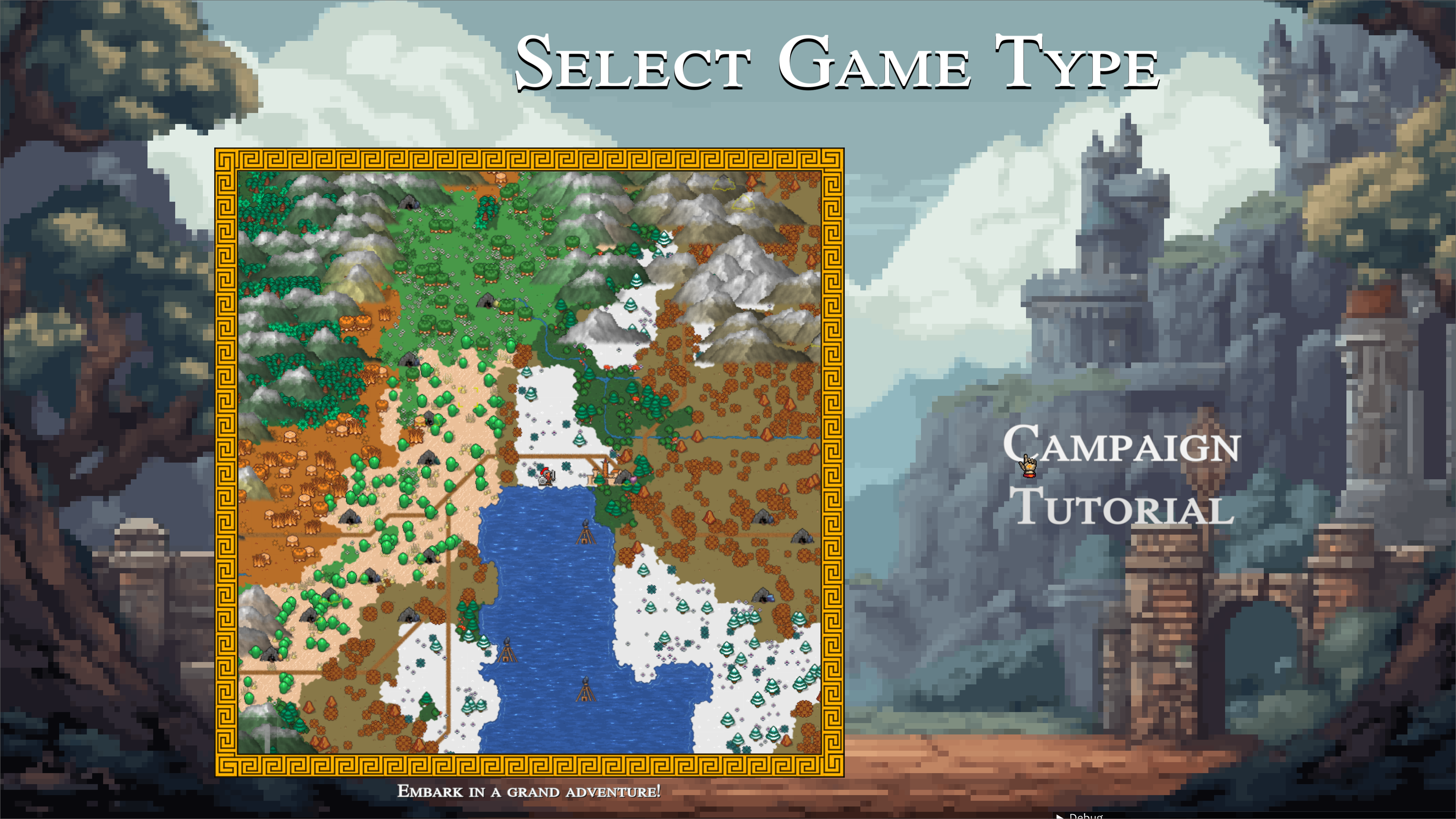
Game mode selection screen
One of my big problems with GUI is that frequenly I can't imagine a good solution to work towards, as I don't think I have an eye for user interfaces. For example, I thought I had a good idea for this screen, which is supposed to be an entry point for the main game, tutorial, or other modes. I have some asset pack backgrounds but they don't look ideal, so I had the great idea to blur them and get away with hiding the details. Well, I posted out of curiosity to /r/indiedev for some feedback, and I was called out for inconsistency with art styles. For me the blurred background looked good. I did some python work to process the images and pixelate them a bit, and the result is indeed a bit better, maybe.
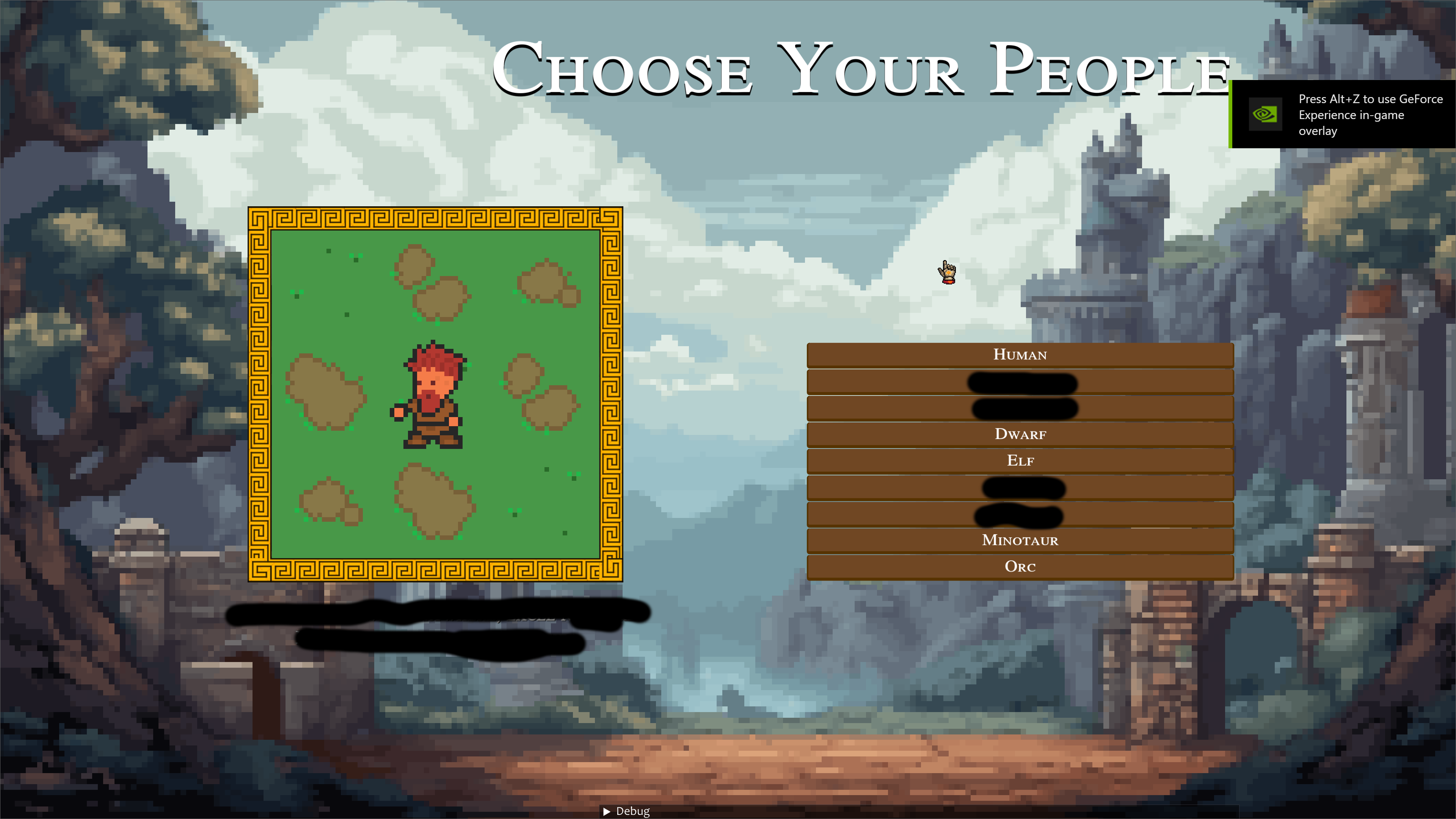
"Choose your people" screen
This is one of the three (so far) screens for character creation. Here you choose between humans and a bunch of other ancestries. You get a preview of what the characters will look like, plus some description
Looks customisation screen
This was a bit more complicated, for a few reasons. First, I need some good non-default, fantasy-friendly sliders. The default sliders are unsuitable (you can see them in my other biome generation videos), so there was a bit of pain to make some weird slider that you can see here. I thought I'd try to create the art, well, it's funky alright, can't deny that :D Another element that I wanted here was a color picker that would only sample from a color palette.
The end result is that you can select, for your given creature type (humans only so far), what hairstyle you like, what beard, and colours of different elements: eyes, mouth, skin, hair, beard. I do need to add some more presets, but I think it's pretty funky as is.
A little cursor!
You might notice in the previous video that there's now a custom cursor! I don't know why, it dawned on me one morning "I want an old school cursor" and that was it. Got one as reference and roughly redid it in aseprite with the AAP64 color palette. I'm quite happy with it, so it stays!
Next is the "Attributes and skills" screen and who knows what else the future will bring! Have a nice weekend.