Boss sites and websites
For this week, more work on lairs, and more work on this website.
Lairs
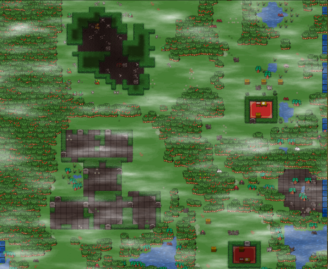
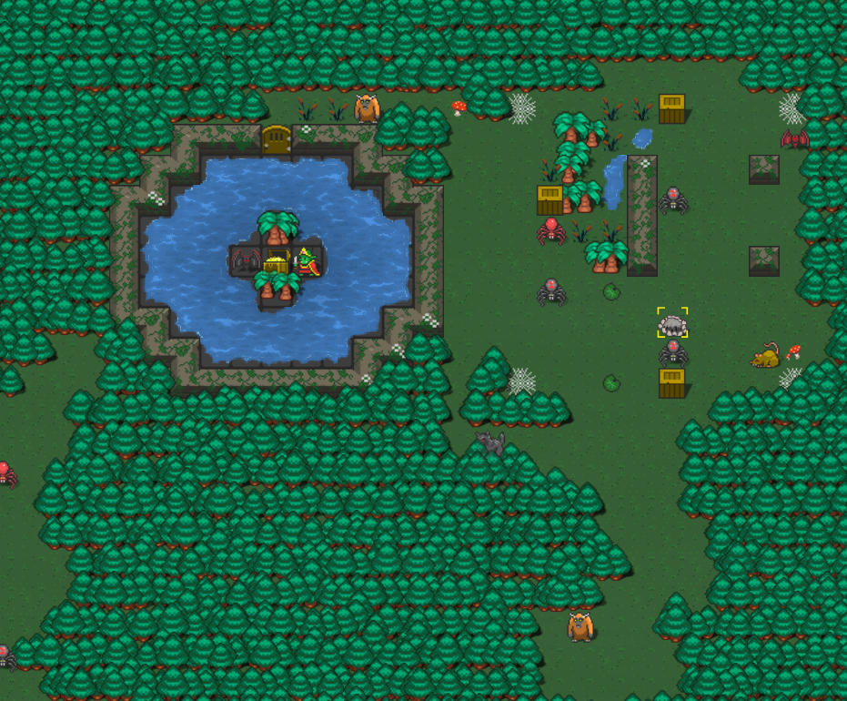
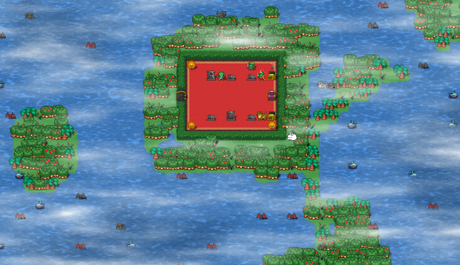
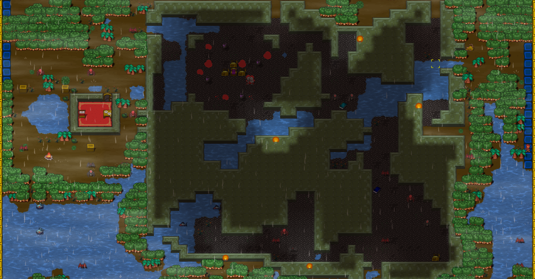
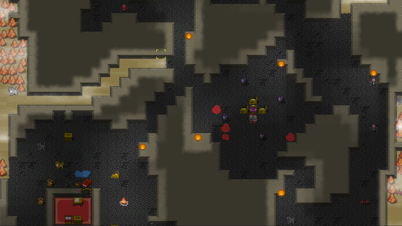
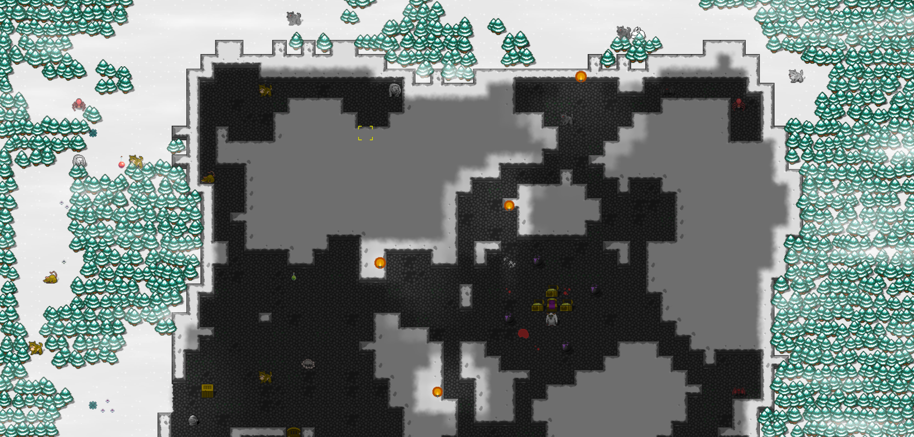
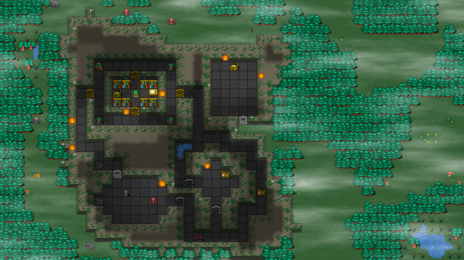
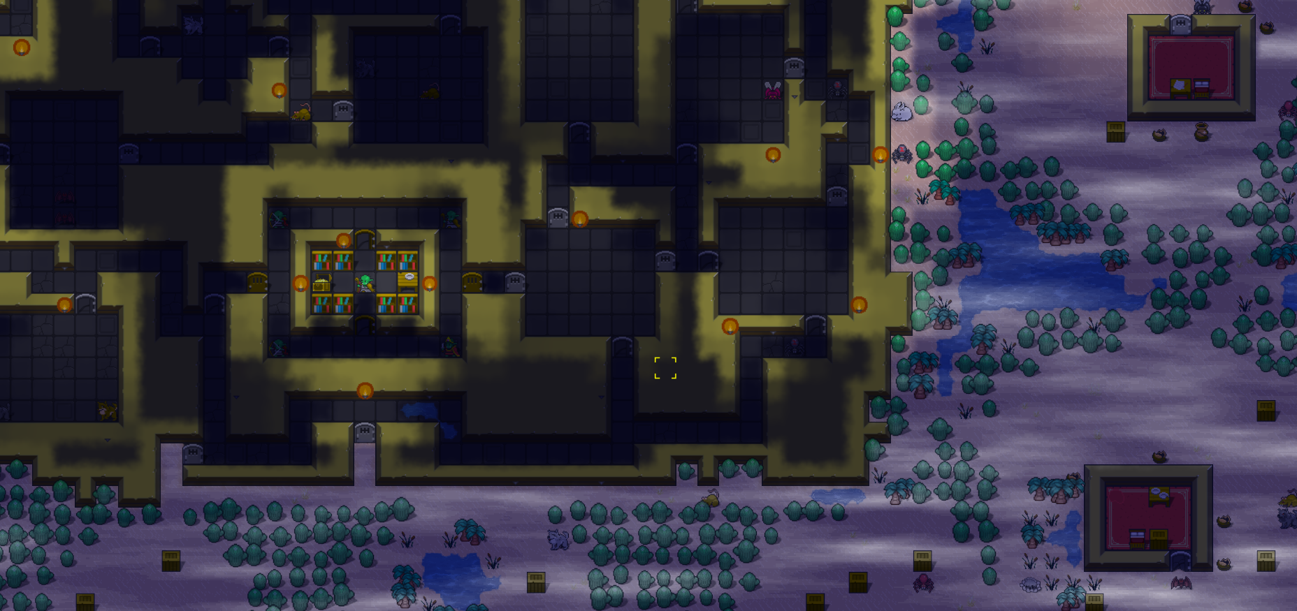
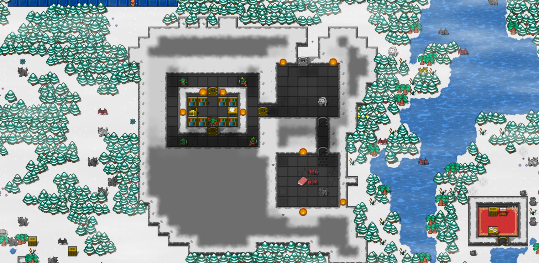
I've added a few more lairs to further stress the system. Picture time!
Sticky web (dev)
The journey of last week's work began in a rather frustrating way. I found out about Google Lighthouse, which is an automated tool for website quality. So I thought I'd try it on my website. The first things that got flagged were the images, and some "quality" metric was really low (sth like 40/100) because images were too big and full-resolution. So I thought I'd revisit the WebP conversion that I abandoned at some point (probably due to frustration with the format and lack of good automation). I tested the conversion on the images from last week, especially on the dragon's lair image. The lossless image is at 70% of the size, which is not superb, but the 99% quality image was well compressed but it changed the colors a bit too much. Not all colours -- just the red apples in the trees. I used ImageMagick for the conversion. I got annoyed and kept trying different settings, to no avail. Then I thought to try other converters. I tried Paint.NET, Irfanview and Gimp, all the same results -- with 100% quality I got lossless, with 99% quality I got bad apples. I was ready to abandon the webp stuff again but I thought I'd try the official tools. I did try them with quality setting to 100 and 99, and got the same result. But then I tried that near_lossless parameter which was not exposed in the other tools, and guess what, my apples remained bright red after compression! So, I wrote a script and converted the entire blog's images in webp with that setting. But that's just chapter one of that saga.
During the web searches, I also found out about that "srcset" parameter in the "img" tag where you put different sized images. So the script also got augmented to create reduced versions for widths of 960, 640 and 320, all in webp. I ran everything through lighthouse again, and the score (for some example problematic page) went up from 44/70 to ... 40/91. Bizarre. Looking at more complaints, one of them was that I didn't specify width/weight in img tags. Wrote another script to edit all pages to add that info. Looking better in lighthouse, but I tried another "image linter" tool for a webpage and now it complains that, if I set "srcset" then I have to set "sizes" as well. I couldn't figure it out though, and the linter keeps complaining that I should add some arbitrary looking numbers that I don't understand, including some calc() expressions, which look dubious to me plus I didn't want to make the page slower for other reasons. Lighthouse complained about things like contrast and the progressive web app score was also terrible, missing splash screens etc. I just want a static web page! At the same time, Google has not been indexing most of the pages of the blog and it doesn't tell me why, so after the recent changes I updated/submitted a new sitemap so hopefully it will start indexing.
Another thing that bothered me was that now all my images seemed to be at 960px (I have full res, 960, 640 and 320), even when I right click and open in new tab. Plus, it's a webp image, so you can't do much with it. After a bit of ChatGPT consultation, hand-holding it a bit and correcting some of its nonsense/lies, I got something marginally more useful. So now, in addition to the "srcset" being correctly set (I hope), when you click on an image or when you right-click and open in new tab, you get the full resolution PNG, which is better. In the end, I did go with the linter's suggestion to use the "calc" expressions, and the Google Lighthouse score is now higher. Oh well, I don't understand it, but as long as it works, fine.
Another thing that I needed to fix was the youtube embeds. Apparently they're slow as hell, so after a bit of reading online, I converted the embed to an image hyperlink (image taken from youtube) and the addition of a button graphic overlay on the hyperlink, so it looks like a legit video but it's really a jpg thumbnail plus a button hyperlink. Lighthouse performance score is now higher (90/90/97/93 for the last 4 blog posts) and all other metrics are well above 90 too
This web stuff is really not my thing, so I'm going to put a stop for a while (scores are good anyway) and check in a couple of weeks to see if Google crawled anything.
Misc fixes
- Boss auras are now in sync with the animation of the entity that projects the aura.
- Creature selection for bosses is a bit more granular. We can provide allowed classifications, roles, temperements, encounter groups etc.
- Doors that link different zones remain closed. This is useful so that bosses won't randomly walk through to different areas.
